Usually, when products want to see how engaged their users are, they look at the (Daily Active Users) / (Monthly Active Users) ratio metric.
And while that’s useful, it only gives a single, blended average. It doesn't show where users fall across the activity spectrum.
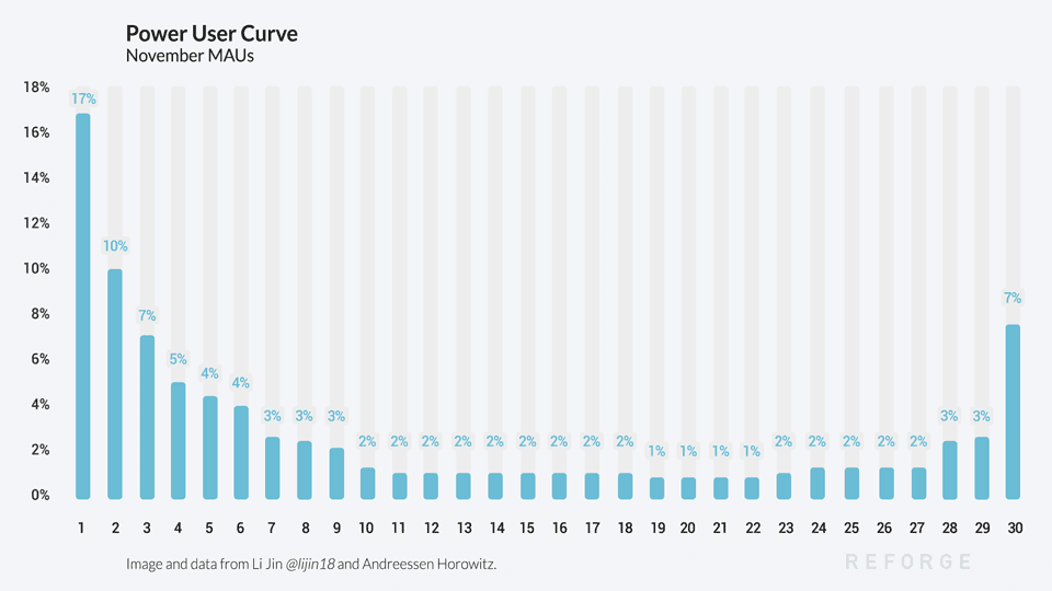
By looking at the Power User Curve, a 30-day histogram that graphs user engagement by the total number of days per month they were active, you can see a more detailed breakdown of engagement to identify and understand power users.
LI JIN, Consumer Investment Partner @ Andreessen Horowitz:
Usually, when products want to see how engaged their users are, they look at the (Daily Active Users) / (Monthly Active Users) ratio metric.
And while that’s useful, it only gives a single, blended average. It doesn't show where users fall across the activity spectrum.
By looking at the Power User Curve, a 30-day histogram that graphs user engagement by the total number of days per month they were active, you can see a more detailed breakdown of engagement to identify and understand power users.
When The Curve Smiles
A curve that looks like a smile - with high bars on the left and right - it shows that users are highly engaged and returning to the app daily. As the product is able to create more power users, the curve will shift further towards the right side of the smile. Facebook has a very right-leaning smile curve, with more than 60% of its MAUs coming back daily.
A Left-weighted Curve
When the curve is left-weighted, most users only have activity one day a month. By this activity metric, the product has very few power users. That's okay, not every product is built on daily returning users. An investing product like Wealthfront or a professional network like LinkedIn is bound to have a more left weighted Power User Curve. Low engagement simply means the company must extract more value from each engagement and create revenue with a business model that isn't tied to daily usage.
Trends & Cohorts
Seeing how the curve changes over time will show if a product getting more engaging and why. A positive shift towards the right means a cohort of users is finding value in the product. This can illustrate how a new release or feature is bringing users back more often. Likewise, products like Uber or Thumbtack would want to look at cohort trends by geographic location to see how their product is developing in different areas and building network effects.
Customizing Your Curve
To get the most from your curve, customize it to your business. It doesn't need to be viewed on the 30-day scale. A SaaS/productivity product focused on the workweek and weekly active users might want to look at their power users on a 7-day histogram, and the activity doesn't need to be app opens or logins.
The curve can look beyond visits by using a deeper action that is more likely to show users getting or creating value. A publishing platform might want to look at “posted content” activity to identify its small contingent of power users. This is how YouTube could look at its creators, or eBay at its sellers.
There's No One Perfect Chart
There's no silver bullet for how to look at user engagement, but the Power User Curve is a helpful way to get away from a blended average of engagement numbers and visualize your users across the activity spectrum, which is helpful in identifying and creating more power users and understanding how to monetize your product around them.
Summarized by Reforge. Original article by Li Jin• Partner @ Andreessen Horowitz